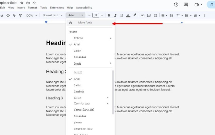
Google Docs is a versatile tool for creating documents, but its default font selection can sometimes feel limiting. Whether you’re looking to add a touch of creativity or maintain brand consistency, customizing your fonts can elevate your documents. This blog will walk you through the process of adding new fonts and importing custom fonts using add-ons, as well as best practices for using fonts in Google Docs.
Adding New Fonts to Google Docs:
Step 1: Open Font Selector
To begin customizing your fonts in Google Docs, you first need to open the font selector:
- Open a Google Docs document.
- In the toolbar at the top, click the drop-down menu that displays the current font name (usually set to “Arial” by default).
Step 2: Browse Fonts
Next, you’ll want to browse the available fonts:
- At the bottom of the drop-down menu, click on “More fonts”.
- A new window will open, showcasing a wide range of fonts that you can add to your document.
Step 3: Add Fonts from the List
- In the “More fonts” window, you can search for specific fonts using the search bar, or browse by categories such as “Serif”, “Sans Serif”, “Display”, etc.
- Click on the fonts you want to add. They will move to the “My fonts” column on the right.
- Once you’ve selected all desired fonts, click “OK”. The new fonts will now be available in your font menu.
Importing Custom Fonts Using Add-Ons:
Step 1: Get Add-Ons
- Open your Google Docs document.
- In the top menu, click on “Extensions” and select “Add-ons” followed by “Get add-ons”.
Step 2: Install an Add-on
- In the Google Workspace Marketplace, search for font-related add-ons such as “Extensis Fonts” or “Fonty”.
- Click on the add-on you want to install, then click “Install”.
- Follow the prompts to grant necessary permissions and complete the installation.
Step 3: Access New Fonts
- After installing the add-on, go back to the “Extensions” menu.
- Select the add-on you installed (e.g., “Extensis Fonts”).
- A sidebar will appear, allowing you to browse and apply a vast array of custom fonts directly to your document.
Best Practices for Using Fonts in Google Docs:
1. Check for Compatibility:
When choosing fonts for your Google Docs documents, it’s important to check compatibility with different operating systems and devices. Not all fonts mean the same thing on Windows, macOS, Linux, or mobile devices, and can cause inconsistencies in how your document appears to different readers. Test your document on a variety of devices and operating systems, and ensure that the document you choose looks accurate and professional regardless of platform. This step helps prevent any unexpected formatting issues and ensures that your document design remains consistent for all viewers.
2. Legibility:
Legibility is a key factor in making sure your document is easy to read and understand. When selecting fonts, prioritize those that are clear and readable, especially for body text. Fonts that are overly decorative or complex can make reading difficult, detracting from the document’s overall effectiveness. Use simpler, more traditional fonts for large blocks of text and reserve ornate fonts for headings or special emphasis. Ensuring good legibility helps keep your audience engaged and improves the overall communication of your message.
3. Brand Consistency:
It’s important to maintain brand consistency in your documentation to create a professional and consistent look. If you are working on documents for a business or organization, use fonts that align with your brand’s established guidelines. These sessions reinforce brand identity and ensure that all your content, from descriptions to reports, has a unified look. Sticking to your brand’s font choices also helps build familiarity and trust with your audience, while connecting a consistent visual path to your brand’s performance and credibility.
4. Consider Your Audience:
When selecting fonts, it’s important to consider your audience’s preferences and expectations. Different audiences have different needs and expectations; for example, a professional or academic audience might favor traditional, serif fonts like Times New Roman or Arial for their readability and formal appearance. On the other hand, a creative audience might appreciate more unique and artistic fonts that convey innovation and originality. Understanding your audience helps you choose fonts that not only look good but also resonate well with your readers, enhancing their overall experience.
5. Test on Different Screens:
Testing your document on different screens is essential to ensure that your chosen fonts maintain their appearance and readability across various devices. A font that looks great on a desktop monitor might not render well on a smartphone or tablet. By previewing your document on multiple devices, you can identify any issues with font size, spacing, or clarity, and make necessary adjustments. This step ensures that all readers, regardless of the device they use, will have a consistent and pleasant reading experience, thereby improving the document’s accessibility and impact.


